MUSASHI
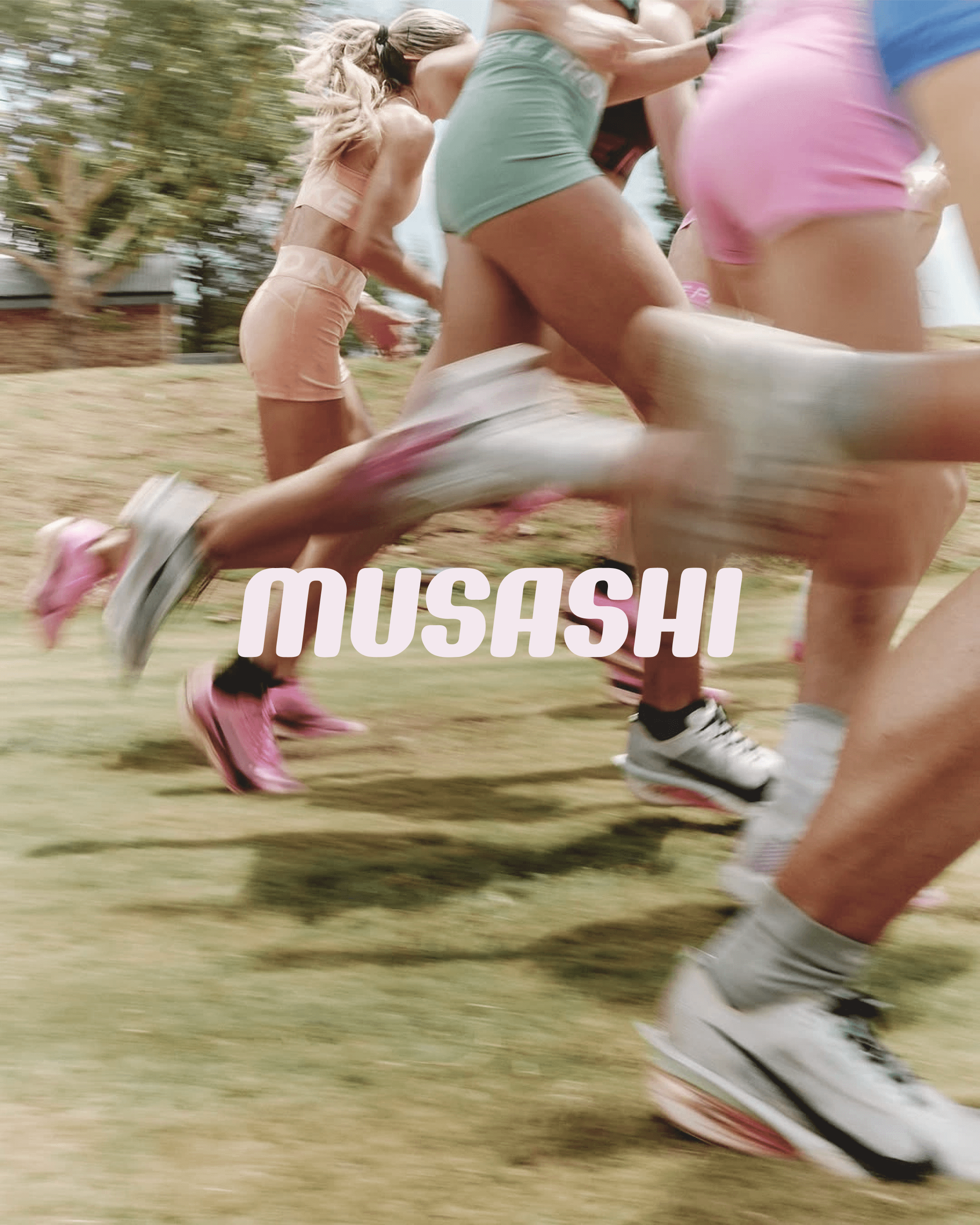
A concept rebrand for Musashi. Musashi was built for the rugby player, the bodybuilder, the CrossFitter who trains twice a day. I rebranded it to be for the girl who enjoys slow walks and pilates, headphones in and disconnected from reality. Because she is an athlete too. She just moves differently. Musashi has always done the heavy lifter well. But I kept thinking about the other person being left out. The one who does Pilates at 7am, takes long walks, listens to something motivational, and takes her recovery just as seriously. The product was already right for this persona. The brand world just never made space for her. So I built one. Two flavours. Two moods. Same formula. Watermelon. Warm, soft, a little indulgent. The colour of a Saturday morning before the world wakes up. Blue Raspberry. Clean, cool, quiet confidence. The colour of a 6am walk when the streets are still empty. The brand stays athletic. The visual language just finally includes the athlete who trains differently. This is a concept project and one of my favourite things I have made. If you want to see what this kind of thinking could do for your brand, my enquiries are open.
Client
MUSASHI
Industry
Wellness
Year
2025
Services
Visual Identity
Art Direction
Brand World Design


Related work

